Design Principle - Final e-blog

18 June - 16 July (Week 10 - Week 14)
Hong Ze Yee / 0335678
Bachelor of Design in Creative Multimedia
Final Project - Final e-blog
INSTRUCTION
FINAL E-BLOG
Part 1 - Visual Analysis
- select a design of your choice (poster/billboard/illustration/etc.)
- conduct a visual analysis of the design in about 500 words

figure 2, illustration
https://i.pinimg.com/564x/c7/6a/c4/c76ac4f0d1d00254773b4319c3430ae1.jpg
Observation
This poster is in portrait format and the main colour observed are blue, magenta and peach. Overall, it has a cold colour tone for the whole picture. There is a girl at the bottom of the picture with a long red hair that create a contrast with the background color. The title is surrounded by her hair. Generally, the focuses are in the middle, the girl and the title.
Analysis
The design is symmetrical balanced. The emphasis is on the central of the image which is the title written in the middle and surrounded by the hair and the girl face as well. First, the seaweed at the bottom bring the focus to the girl face followed by her hair. The long hair has created a visual which is called movement leads the viewer's eyes to read the words at the middle.
Thus, there are many small elements on the hair. The two birds at the top of the poster are generally symmetrical. The fishes in blue colour has bring a balance on the poster. There are also small repetition elements of leaves, sea shell and flowers are found on the hair as well. All these compositions give the poster a sense of hierarchy and make the whole poster rich and unity.
Interpretation
This a book cover is design by Louise O'neill, an Irish author who writes primarily for young adult. This is her first novel for a YA audience. Described as "feminist retelling" of Hans Christian Andersen's The Little Mermaid, and in this it certainly succeeds with deep undercurrents of darkness and rage.
Part 2 : Visual Analysis
we were require to produce a work of design in A4 or A3 size, influenced by the design that we have analyzed.
figure 1, layout
figure 2, progress
figure 4, final outcome
REFLECTION
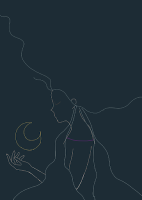
The idea of my design is something vivid and a colour contrast of the character and the background. I made the character stands out with bright colour tone with a little transparency so that it wont look so stiff and "too white" since the hair colour is very similar with her skin colour. The design I've choose to analyze is a mermaid, which is fantasy. So I would like to create something similar yet different with mermaid. The girl I've created is in white and she is very bright, shows that she has the power to create light and she can separate light from darkness.
Based on the design that I have choose to analyze, we can see that the mermaid's hair takes up the most space in the whole picture and the hair is dynamic. Same as thing goes to my design, the hair shows a visual which is called movement, that will bring the focus on to the girl's face then follow by the moon. I am more likely to add something for the character and the background instead of making the hair takes most of the space the picture. So I decided made the hair floats and only takes half of the space.


Comments
Post a Comment