Design Principle - Weekly exercise / Lectures

Week 1 - Week 5
Hong Ze Yee / 0335678
Bachelor of Design in Creative Multimedia
INSTRUCTION
MIB :
LECTURE AND EXERCISES
Week 1
Gestalt & Contrast
Gestalt & Contrast
Lecture note :
Contrast - such as light vs dark colours, large vs small shapes
Gestalt - organized into five categories which is proximity, similarity, continuity, closure and
connectedness.
Research & reference :
Contrast theory :
Contrast happens when two elements on a page are different. Contrast is often used to grab people's attention. Contrast can be created through texts, shapes, textures, colours and sizes.
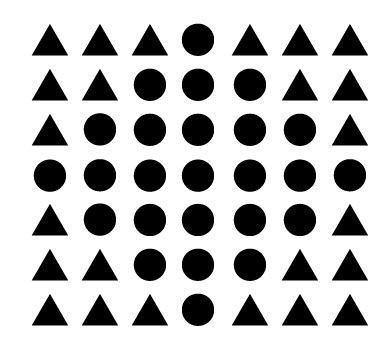
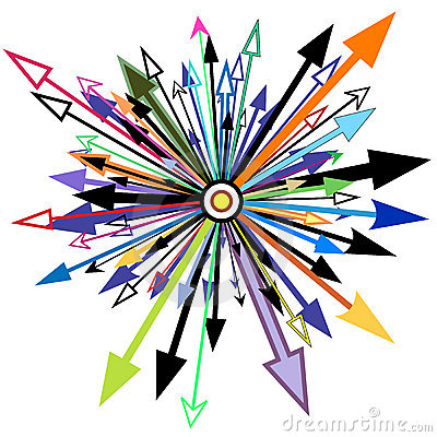
Figure 1 research of gestalt
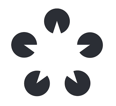
Figure 2, research of gestalt
Gestalt theory :
The term "gestalt" stands our for "unified whole". It is a theory that describes how humans see objects by grouping similar elements and shapes together. It is based on the idea that the human brain will simplify complex designs or images.

Figure 3, research of gestalt

Figure 4, research of gestalt

Figure 1, research of contrast
Figure 2, research of contrast
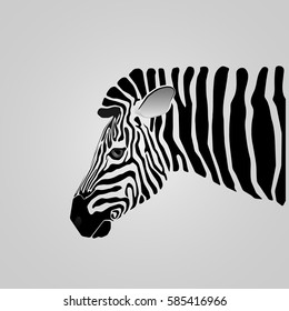
Figure 3, research of contrast
My Progress :

Final design outcome :

Figure 1 Contrast
For this contrast art work, i came out with an idea about 'fox' after I do the research about contrast zebra.

Figure 2 Gestalt
For this gestalt artwork, i think a lot about triangle shape to build an image. The first one is a bird, second one is a yacht.
Reflection :
Before I start the artwork, I do some research about gestalt and contrast to understand the basic concept. After all, I start with sketching on the paper and cut it into shapes and collage it together to form the contrast and gestalt image. After I got my feedback from Miss Anis, I think I should do more research and refer to more examples about gestalt to make me more clear about the concept of gestalt.
Feedback : I got the feedback from Miss Anis, she said my contrast work is good but maybe I can get more improvement gestalt. From the artwork that I've made for gestalt is a little bit confuse.
1. Emphasis - is part of the design that catches the viewer's attention such as contrasting with other
areas.
2. Balance - symmetrical balance and asymmetrical
symmetrical balance - has equal weight, radial balance, bilateral balance
asymmetrical balance - varying visuals with different weight that balances one another
3. The golden ratio - more on aesthetics and visual harmony
4. Rule of Thirds - aligning subject with the guide lines such as placing the horizon on the top or
bottom line.
Research & reference :
Balance refers to the distribution of visual weight in a work of design. balance can be both symmetrical and asymmetrical.


Weekly practical work :
prepare pen, pencil, marker (colours are allow)


Feedback : I got the feedback from Miss Anis, she said my contrast work is good but maybe I can get more improvement gestalt. From the artwork that I've made for gestalt is a little bit confuse.
Week 2
Emphasis, Balance, The Golden Ration & Rule of Thirds
Emphasis, Balance, The Golden Ration & Rule of Thirds
1. Emphasis - is part of the design that catches the viewer's attention such as contrasting with other
areas.
2. Balance - symmetrical balance and asymmetrical
symmetrical balance - has equal weight, radial balance, bilateral balance
asymmetrical balance - varying visuals with different weight that balances one another
3. The golden ratio - more on aesthetics and visual harmony
4. Rule of Thirds - aligning subject with the guide lines such as placing the horizon on the top or
bottom line.
Research & reference :
Balance refers to the distribution of visual weight in a work of design. balance can be both symmetrical and asymmetrical.
figure 1, research of balance
figure 2, research of balance
Emphasis is usually used to create focus and dominance, causing a particular element stands out, drawing attention to the eyes. Emphasis can be created through the shapes, colours and value.
figure 3, research of emphasis
figure 4, research of emphasis
prepare pen, pencil, marker (colours are allow)
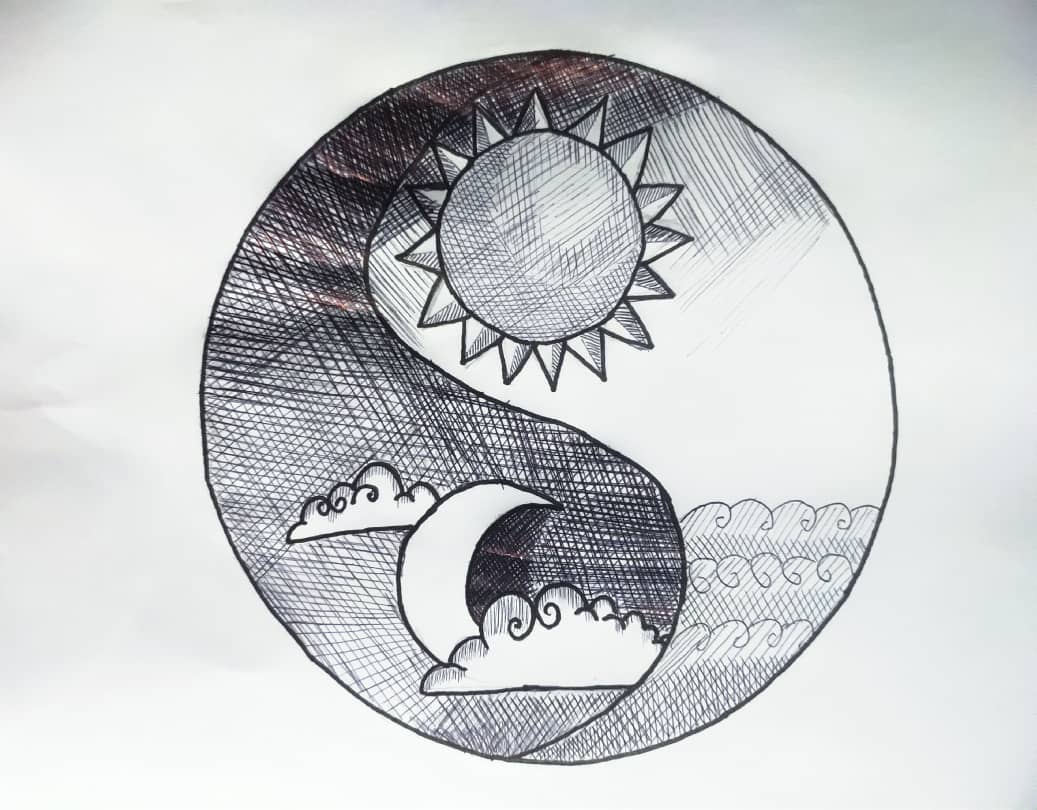
Figure 1 Balance

Figure 2 Emphasis
Reflection : This week I think everything is just fine and I quite understand today's lecture (balance & emphasis). So, we were asked to create two artwork by using pen and marker.
Feedback : Miss Anis said the "balance artwork" is ok, and she likes the "emphasis artwork" because there are mini monsters hiding in the word. But to make it more emphasis, Miss Anis suggested me to use marker pen to draw the lines of the word to make it thicker and create a visual hierarchy.
Week 3
Repetition, movement, hierarchy and alignment
Repetition - means repeating the same or similar elements throughout the design. (unity, consistency)
Movement - used to create impression of action in an artwork (directional lines, repetition, position
and size of object)
Hierarchy - also visual hierarchy(what we see first in an artwork)object that guides/leads the
audience's eyes from one object to another.
Alignment - how the object/text/image align together to create a flow to the audience's eyes to follow.
Research and reference :
Repetition basically means reusing the same / similar elements or shapes to create a whole design. However, repetition also create rhythms and patterns within the design.

figure 1, research of repetition
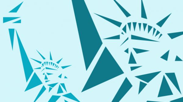
figure 2, research of repetition
Movement has the ability to lead the viewer's eyes from one object to another object. Movement among a design can come from lines, shapes, colours, forms and curves.

figure 3, research of movement
figure 4, research of movement
This week practical is to create two artwork that involve repetition and movement.
Sketching :
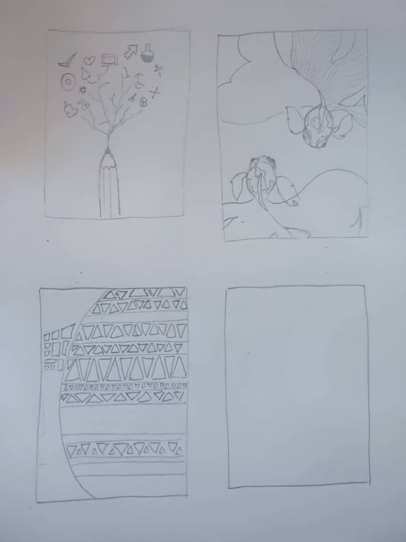
figure 1, sketching

figure 2, movement

figure 3, repetition
Reflection : I understand the lecture but I think I didn't do it very good in this exercise, I feel like it can be improve more.
Feedback : Miss Anis said the "fish" that I draw is good and it has express the word "movement". If the fins can make it more details and fluent, it would be better.
Week 4
Harmony, unity and proportion
stamps, finger prints, linoleum prints, rubbings
1. Harmony - involves the selection of elements that share a common trait. (same arrangements,
similar colours)
2. Unity - occurs when these elements are composed in such a way that they are balanced and
give sense of one, creating a theme.
3. Proportion - refers to relative size, is the relationship of two or more elements in a design and how
they compare with one another. Proportion is said to be harmonious when a correct
relationship exists between the elements with respect to size or quality. The effective use of proportion in design often results in harmony and unity.
Research and reference :
Harmony is basically have the similar shapes or similar colours that makes the overall picture looks harmony.
figure 1, harmony, same colours

figure 2, harmony, similar shapes

figure 3, harmony, same shapes and colours
Unity is basically when elements within a space or composition combine to make a harmonious whole. Elements are composed in such a way that they are balanced and give a sense of oneness.
i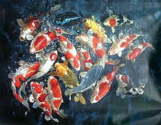
figure 4, unity

figure 5, unity
Weekly practical work :
For this week, we have to create two artwork about harmony and unity.
Sketching :

figure 1, sketching for harmony

figure 2, sketching for harmony
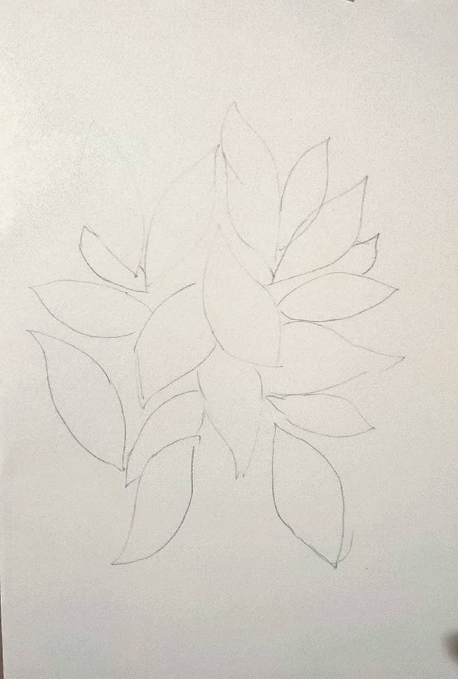
figure 3, sketching for unity

figure 4, material

figure 5, final work

figure 6, final work
Reflection : We don't have lecture class for this week because its public holiday. So, there is a lecture video uploaded at Discord for us to watch the lecture. After watching the video, I actually not really
clear about the concept of harmony and unity because it's abstract. After watching it, I do a lot of research about harmony and unity so that I can create my artwork that really represents the word "harmony and unity".
Feedback :
No feedback is given
Week 5
Symbol, Imagery and Typography
1. Symbol - is a sign, shape or object that is used to represent something else. In design,
symbols can provide or convey information, equivalent to one or more
sentences of text, or even a whole story.
2. Graphic symbols - is pictorial symbols (image related and simplified pictures). For example, when
we think about apple, the symbol is always a big red round shape with a small
green leaf shape.
3. Abstract symbol - consider as non figurative (can look like the objects that they can represents but
have less details). Often used to faster information transformation such as toilet
sign, incoming phone call sign and wash hand sign.
4. Arbitrary symbol - have no resemblance at all to the objects or ideas they represent) invented and
constructed. Many are based on geometric shape sand colours. We have to
learn arbitrary symbols.
5. Imagery - is a vital part of design, be it print or digital. Users and viewers are able to
relate a concept or a brand if the right images are used in work of design. (the
right information / feel) such as memes.
6. Typography - is the arrangement and placement of text in order to convey different meaning
and purpose. Successful used of typography will often result in visual hierarchy
and it also helps balance the visual structure of the design between the content
and the visuals.
Sketching :

figure 1, sketching for arbitrary symbol
Weekly practical work :

figure 1, arbitrary symbol
This is a medical help symbol
File link : https://drive.google.com/open?id=1yehURIoti4l1_aqBI0QjY2Y9Ht3g9Hh7

Figure 2, Image and words
Concert poster
File link : https://drive.google.com/open?id=1MtGYPsyMsBIYAyW1curZ6vnR2oJc_Vqz

figure 3, original picture

figure 4, a picture about peace
File link : https://drive.google.com/open?id=1XSn2N3zl4kdmgiZ-B2BBVbQJjOCzgozm

figure 5, original picture
Feedback :
I send my sketching to Miss Anis and she said all the symbol that I have created are still relatable to the idea except the medical help symbol. So I choose that one because I think the red colour water drop is representing medical and the wings are representing help and save.
Reflection :
This week exercises is a bit harder to think of an idea. I've struggle around two days to come out with my own idea is when I saw a concert picture in my phone. the picture is taken in high angle and capture the crowd. So I think this can be a ticket or poster for a concert. I try to make some adjustment for the picture, playing around with blending mode and adjust the colour contrast of the picture. For the second artwork is more like a book cover as it is simple and tidy. So I used this picture to design a simple book cover.
Week 6
Self Portrait
From week 6 onward, we will be focusing on our projects. Miss Anis give us a brief of our project 1, Self Portrait. Examples and information are provided in lecture slides.
Self portrait : is a self representation in a form of a drawing, painting, design, sculpture. A visual depiction of the self. Below are the references and examples that given by Miss Anis in the lecture slides.
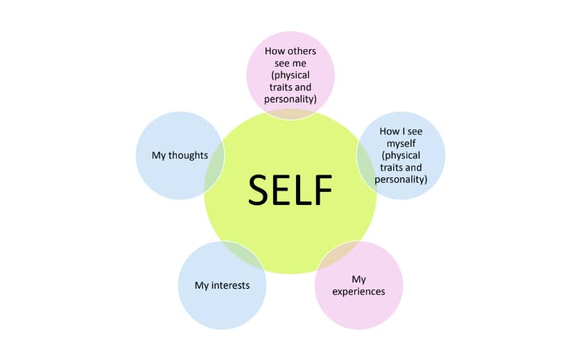
figure 1, self
Self is basically our personality or nature, your background, history, life experiences, favorite and everything that about ourselves.
Self portrait : is a self representation in a form of a drawing, painting, design, sculpture. A visual depiction of the self. Below are the references and examples that given by Miss Anis in the lecture slides.

figure 1

figure 2, this is a oil on canvas. This picture has a big colour contrast but the overall is harmony and it looks good. Thus, There is the expression on the person's face.

figure 3, this is a watercolour on paper as we can see that its using the similar colour.
Week 7
Week 8
Observation
We don't have lecture this week because Ms Anis was not feeling well and we were asked to watch Miss Jinchi's latest lecture about project 2 brief on Microsoft Team.
This week lecture is about the importance of observation. Observation is an active act of acquiring information. through the senses, of a subject matter in its natural setting. Thus, observation is important to designers as it's enable them to see "problems", as well as getting ideas for solutions to those problems. For designers, observation is much more than just collecting and analysing data. With their own sensibility, designers have another way of approaching observation which also inspires their work.
Creative works of observation :

figure 1, observing building
Translating it into a work of art, it may not looks realistic because this is a translated image of what he saw.

figure 2, how he translate his room

figure 3, this one looks like a collage yet it is not

figure 4, sink of lab - watercolour painting

figure 5, collage work
Week 9
This week is consultation of project 2 which is sense of place. After I show my artwork to Miss Anis, she suggest me to add something interesting into my artwork such as add fishes swimming in the water or that is sunny day in the water reflection.
Week 10
Visual Analysis
What is visual analysis?
- Visual analysis is a method of understanding design that focuses on the visual elements and principles.
- It is an explanation of visual structure for its own sake, basically is about what you see and what you'll get.
- Visual analysis is to recognize and understand the visual choice the artist made in creating the artwork.
How to do visual analysis?
By observing and writing about separate parts of the art object, you will come to a better understanding of the art object as a whole. You can consider the composition, colour, space and perspective in the artwork and go beyond you first impressions. Try to make a sketch of the work can help you understand it's visual logic.
How does Visual analysis work?
- observation - looking, thinking and finding good language to communicate what you notice.
- analysis - think about your observations, combine together the specific visual elements that you've identified.
- interpretation - what is the meaning of the design? What is the purpose for it to be created?
The following is an example of visual analysis that Miss Anis has shown in class.

figure 1, a tattoo poster
Observation :
- portrait format
- colours observed are red, magenta, green and yellow. Overall is a colourful design
- organic lines applied throughout the composition
- there are words on he top of the design and numbers on the middle right, an image is featured at the centre
Analysis :
- symmetrically balanced
- emphasis is on the central image (the face of a woman)
- the snake's coilling body (movement) leads one to read the words at the top
- 3 sets of number aligned at the right
- repetition of flowers and leaves
- unity overall composition
- there is proportion in the layout, creating hierarchy
Interpretation :
- this is a poster designed for a tattoo convention in Paris, France
- held from 17-19 Jan 2020
- inspired y Art Nouveau
- cultural implication - tattoos are also a form of art
REFLECTION
I have learned a lot of design principle in this module such as composition, emphasis, movement and so on. All these things really help me to improve a lot in my artwork and not only in this module. At the very beginning I don't think I work well and there are details, lines need to be improve. But during this semester, I can see that my artwork has obviously improved after finish the all the exercises. I appreciate that I can join this class and I hope all the knowledge I have learn in this module can apply on my work and improve my design ability as well.

Comments
Post a Comment