Typography - Project 2A
Typography - Project 2A
05 June - 11 June (Week 8 - Week 10)
Hong Ze Yee / 0335678
Task 3 : Type Design & Communication
Project 2A : Font Design
LECTURE NOTES
Week 7 : Project 2A briefing (29/05/2020)
Briefing of project 2A
Our project 2b is actually start on next week, but Mr Vinod brief us one week early so that we will have more time to do our project. After the briefing, Mr Vinod show us the diagram of typography basic which included, median line (mean line), baseline, x-height, ascender height, cap height and descender line.


Week 8 : (05/06/2020)
We have consultation for our sketches and progress of our project 2b and then Mr Vinod will go through our blog for our project 2a at the same time, we were asked to continue to digitize our letters after we got the approval. During tutorial session, Mr Vinod will show us how to use Fonts Lab and how to create our poster.
The feedback of the project 2a will be given after class, all the feedback are recorded in "feedback" session.
Week 9 : Typography in Different Mediums (11/06/2020)
This week lecture is basically about the use of typography on screen and print.
Typography is affected by many things such as operating system, system fonts and the device of its screen.
INSTRUCTION
MIB :
PROJECT 2A : Font Design
29/05/2020 (week 7)
Week 7 : Briefing of project 2A (29/05/2020)
We need to design a limited number of western alphabets which is A I M E P Y T G D O B ! , .
Sketches :

Try to digitize it in Adobe Illustrator :


Finalization :
I've choose the second attempt as my final decision.

FEEDBACK
Specific feedback :
1. Need to edit the middle stroke of the letter "b" because its thicker
2. Need to have more gap between the dot and the stroke of the exclamation mark
3. no white line in the comma
General feedback :
Generate and design the poster quickly
REFLECTION
Week 7 : Briefing of project 2 (29/05/2020)
Experience : I actually have many ideas for designing fonts but Mr Vinod says the font that we design cannot be too playful. So, i try to come out with the idea that have small details in the font but not too many.
Observation : When i start digitizing the letter, its quite complicated and this is extremely hard for me.
Findings : to come out with a unique idea without breaking the rule is very hard. Thus, i faced a lot of technical difficulties while digitizing it and I used a lot of time to do this.
Week 8 : (05/06/2020)
Experience : This project is harder for me compared to the last one. Designing letters need to be very careful in every details and make sure the strokes have the same size.
Observation : I've tried many different ways to make the letters have the same size without distort it.
Findings : Need to explore more and figure it out what is the problem, always try new ways to solve it.
Week 9 : (11/06/2020)
Experience : Struggled a lot in front of my laptop, there are so many technical difficulties such as my letter copy from Illustrator to FontLab does not work well or something went wrong.
Observation : I don't know what happened when things do not work sometimes but it suddenly works in the next second.
Findings : Just keep trying and look for more solutions.
FURTHER READING
05 June - 11 June (Week 8 - Week 10)
Hong Ze Yee / 0335678
Task 3 : Type Design & Communication
Project 2A : Font Design
LECTURE NOTES
Week 7 : Project 2A briefing (29/05/2020)
Briefing of project 2A
Our project 2b is actually start on next week, but Mr Vinod brief us one week early so that we will have more time to do our project. After the briefing, Mr Vinod show us the diagram of typography basic which included, median line (mean line), baseline, x-height, ascender height, cap height and descender line.

figure 1, basic typography
- Median line (mean line) : median line is most of the lower case letters should reach their maximum height.
- X - height : the distance between median line and baseline. The height in any typeface of the lowercase 'x'
- Baseline : is the imaginary line upon which a line of text rests.
Understanding letter forms
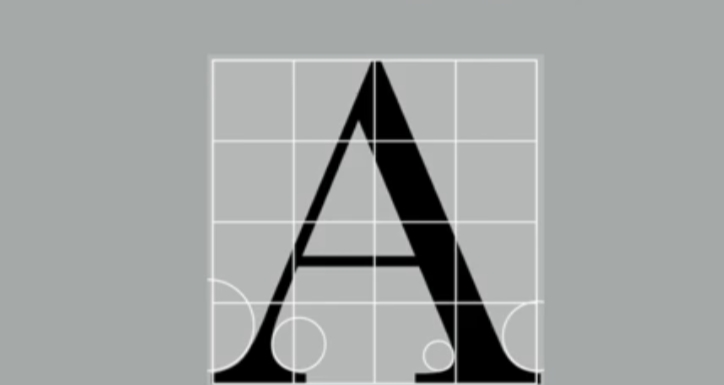
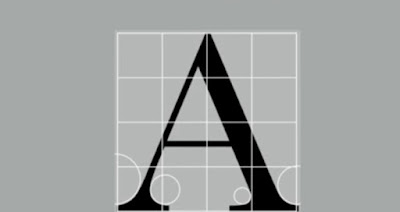
figure 2, serif letter that introduce the differences in the thickness of the stroke and the size of the arc. The uppercase letter form above suggest symmetry, but in fact it is not symmetrical. As we can see it in the picture, the two different stoke weights of the Baskerville stroke form (below) is more noteworthy is the fact that each bracket connecting the serif to the stem has a unique arc.

figure 3, letters
Often times, we thought the letters are the same but they are actually not. The have the different details in each individual form such as how the stems of the letterforms finish and how the bowl meet the stems quickly reveals the palpable difference in character between the two.

figure 4, the two letters overlap to see the differences.

figure 5, letterform
Here is the x-height that generally describe the size of the lowercase letterforms. However, we should be alert that curve stroke which we often ignored it, such as "s", "r" must rise above the median (or sink below the baseline).
Class exercise :
After the briefing of project 2, we were asked to measure the stroke of the letters in Adobe Illustrator. First of all, we need to create the artboard with 1100pt x 1100pt and then duplicate the other two. One letter must be in one artboard. So, the first exercise I have did in class is the three letters "H", "O", "D".

figure 1, class exercise
After I have done the exercise, I've got my feedback from Mr Vinod. He says there is a little mistake which is the letter didn't stay on the baseline, and then I have to measure the curve of the letters by using shapes in order to see the difference of the curve size.
We have consultation for our sketches and progress of our project 2b and then Mr Vinod will go through our blog for our project 2a at the same time, we were asked to continue to digitize our letters after we got the approval. During tutorial session, Mr Vinod will show us how to use Fonts Lab and how to create our poster.
The feedback of the project 2a will be given after class, all the feedback are recorded in "feedback" session.
Week 9 : Typography in Different Mediums (11/06/2020)
This week lecture is basically about the use of typography on screen and print.
Typography is affected by many things such as operating system, system fonts and the device of its screen.
INSTRUCTION
MIB :
PROJECT 2A : Font Design
29/05/2020 (week 7)
Week 7 : Briefing of project 2A (29/05/2020)
We need to design a limited number of western alphabets which is A I M E P Y T G D O B ! , .
Sketches :

figure 1, sketching before digitizing
Mr Vinod say is better to not separate the letter "M"
ProgressMr Vinod say is better to not separate the letter "M"
Try to digitize it in Adobe Illustrator :

figure 2, digitizing
The letter A, M, E, P and Y looks weird, Mr Vinod suggest me to make it more tangular.

figure 3, after editing the letters but the exclamation mark has to be more gab between the dot and stroke and there should not have white line in the comma.
Copy letters from Adobe Illustrator to FontLab :

figure 4, placing the letter into x-height.

figure 5, letter forms being individually spaced.
Type out all the letters and designing poster in Adobe Illustrator :
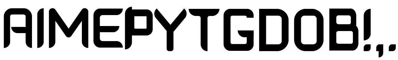
figure 6, overall looking
 figure 7, sketching the poster


figure 8, first attempt

figure 9, second attempt

figure 10, third attempt

figure 11, edited version
I realized that the letters on the top doesn't look smooth, so I moved the "A" to the top and the word "TYPE" will remain.
I've choose the second attempt as my final decision.

figure 12, jpeg version of my finalization
FEEDBACK
Week 7 : (29/05/2020)
Specific feedback : No feedback is is given
General feedback : No feedback is given
General feedback : No feedback is given
Week 8 : (05/06/2020)
Specific feedback :
1. Project 1 (Formatting text)
- PDF file was not in the blog
- the separation line is wrong, not using underscore and enter.
2. Project 2 (Letter design)
- try to make letter "A" and "E" tangular, make the curve of letter "B" more wider
General feedback : No general feedback is given.
Week 9 : (11/06/2020)
1. Need to edit the middle stroke of the letter "b" because its thicker
2. Need to have more gap between the dot and the stroke of the exclamation mark
3. no white line in the comma
General feedback :
Generate and design the poster quickly
REFLECTION
Week 7 : Briefing of project 2 (29/05/2020)
Experience : I actually have many ideas for designing fonts but Mr Vinod says the font that we design cannot be too playful. So, i try to come out with the idea that have small details in the font but not too many.
Observation : When i start digitizing the letter, its quite complicated and this is extremely hard for me.
Findings : to come out with a unique idea without breaking the rule is very hard. Thus, i faced a lot of technical difficulties while digitizing it and I used a lot of time to do this.
Week 8 : (05/06/2020)
Experience : This project is harder for me compared to the last one. Designing letters need to be very careful in every details and make sure the strokes have the same size.
Observation : I've tried many different ways to make the letters have the same size without distort it.
Findings : Need to explore more and figure it out what is the problem, always try new ways to solve it.
Week 9 : (11/06/2020)
Experience : Struggled a lot in front of my laptop, there are so many technical difficulties such as my letter copy from Illustrator to FontLab does not work well or something went wrong.
Observation : I don't know what happened when things do not work sometimes but it suddenly works in the next second.
Findings : Just keep trying and look for more solutions.
FURTHER READING
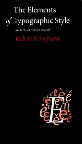
Figure 1, cover of The Elements of Typographically Style
This book is written by Robert Bringhurst, the Elements of Typographic style is on many designer's bookshelf and is considered to be a classic in field. The content will help you to understand the typography inside out. Bringhurst covers all the aspects of using type, from details to individual letters to page grids. He describes the usage of analphabetic symbols, rules of composition and criteria for type selection. Thus, it will also let you understand the origin and character of some popular typefaces.


Comments
Post a Comment